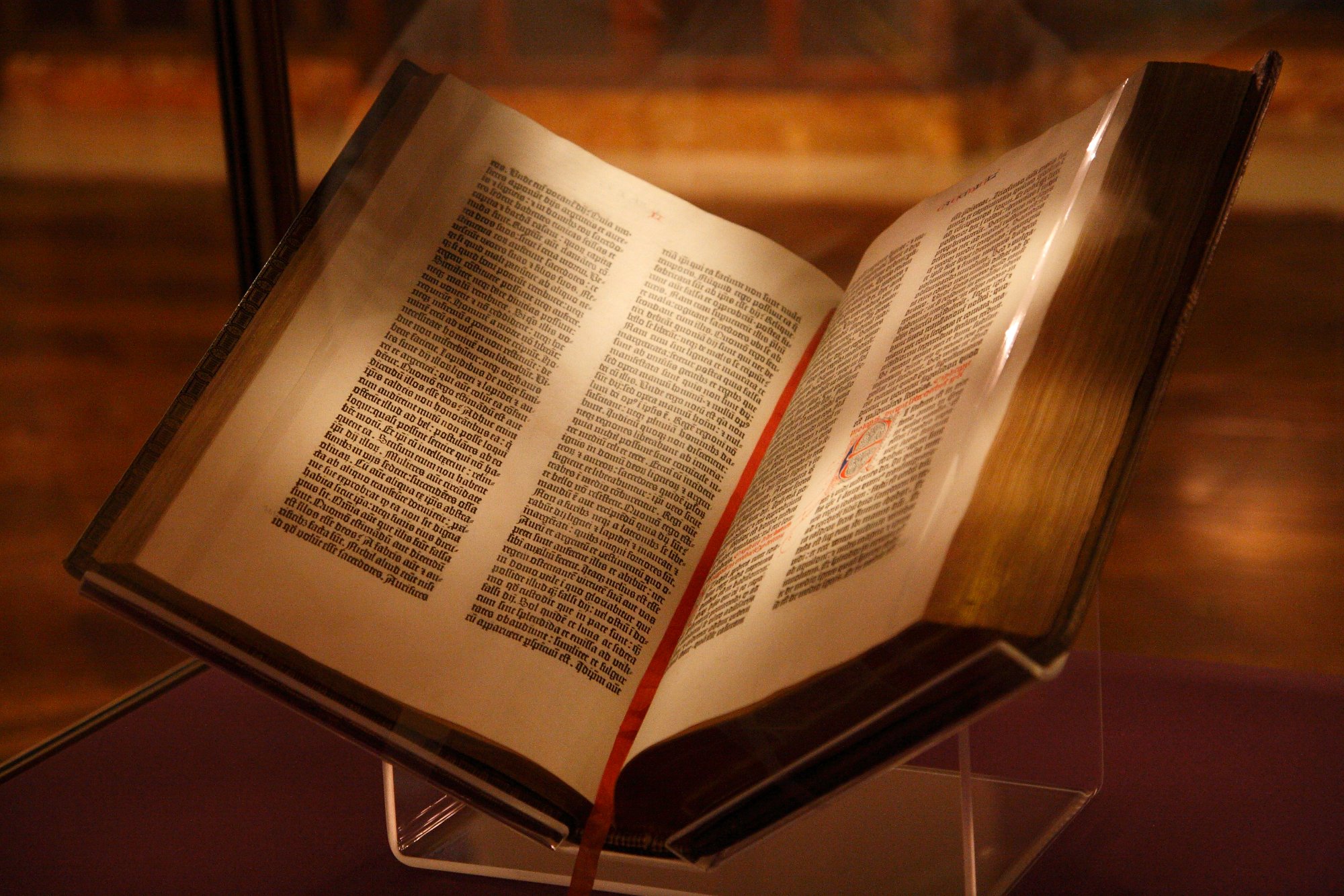
c.1455 — Gutenberg Bible
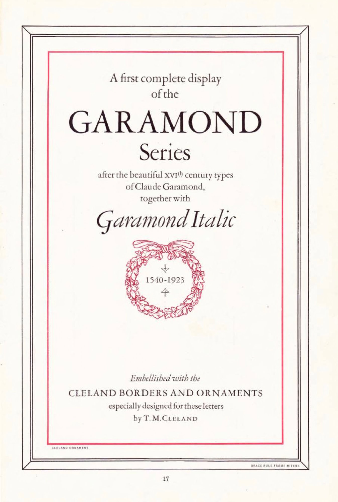
1530 — Garamond Type
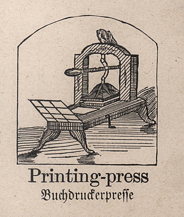
1440s — Gutenberg Press
For millennia, written letterforms were a handcraft. Cuneiform wedges pressed into clay tablets. Egyptian hieroglyphs carved in stone. Roman capital inscriptions — the Trajan column still influencing type design today. Medieval monks perfecting Carolingian minuscule by candlelight. Every letter made by hand, one at a time.
Johannes Gutenberg's invention of the movable type printing press in Mainz around 1440 is arguably the most consequential technological event in human history. Knowledge could replicate. The Bible — the first great printed book — demonstrated that type could be both functional and beautiful. The Renaissance followed.
The Enlightenment brought rationalism to type. Bodoni in Parma, Didot in Paris — high-contrast, geometric, coldly brilliant. Then steam power brought industrial printing, and with it, chaos: wood type, display faces, dozens of competing styles shouting from every hoarding and broadsheet. Victorian excess in letterform.
The early 20th century was a war on Victorian ornament. Art Nouveau, then Futurism, then the Bauhaus, then Jan Tschichold's New Typography — all demanding that form follow function. Asymmetric layout. Sans-serif type. Whitespace as a design element. The foundations of modern graphic design, written in revolution.
From Zurich and Basel came the International Typographic Style — the most influential design movement of the 20th century. The grid. Objective photography. Sans-serif type. Flush-left, ragged-right composition. And at its center, one typeface designed in a small Swiss town that would become the most used in the world: Helvetica.
The Macintosh, Adobe PostScript, and Aldus PageMaker caused a second Gutenberg revolution. Type went from hot metal and phototypesetting to pixels and vectors. Everyone could now set type. Most did it badly. The democratization of typography was glorious and terrifying in equal measure.
Variable fonts — introduced in 2016 — allow a single font file to contain infinite variations along any design axis: weight, width, optical size, slant, and more. Typography is no longer discrete. It is continuous. Meanwhile AI systems are beginning to generate type, and the question of what a typeface even is grows increasingly complex.
From Gutenberg's hand-cast lead type to machine learning systems that generate letterforms from latent space — the discipline of typography has always been the intersection of language, technology, and human vision. It will continue to be.
Variable font axes will expand beyond weight and width to include expressiveness, emotional register, and context-aware adaptation. Type that reads the room — adjusting weight for ambient light, width for reading distance, style for emotional context.
Generative AI will increasingly complete, extend, and create typefaces. The human type designer's role becomes curation, direction, and quality judgment rather than drawing every curve. Custom fonts become accessible to any brand, at any budget.
As AR and VR mature, typography must work in three-dimensional space — readable from any angle, at any distance, in motion. The problem Gutenberg solved in 2D resurfaces in 3D. Spatial computing needs a new typographic grammar.
When a font can vary infinitely along any axis, when AI generates letterforms on demand, when a glyph can contain animation — the definition of a typeface dissolves. Gutenberg answered this question in metal. We are answering it again, in code.
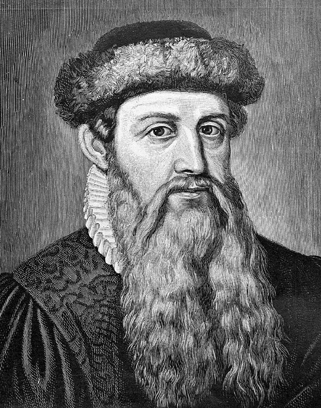
The goldsmith from Mainz who changed everything. Gutenberg's synthesis of the screw press, movable metal type, and oil-based ink created the first practical printing system in the West. His Biblia sacra of c.1455 remains one of the most beautiful books ever made — and democratised knowledge overnight.
Wikipedia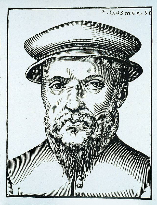
The Parisian punchcutter who defined what a Roman typeface could be. Garamond's types — lighter, more refined than anything before them — set the template for French and European printing for a century. His designs survive in dozens of modern revivals still used daily 500 years on.
Wikipedia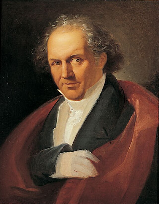
The Parma typographer who took rationalism to its extreme. Bodoni's typefaces — with their stark contrast between thick strokes and hairline serifs — represent Neoclassical type at its most beautiful and severe. Modern, Didone, and fashion magazine typography all trace back to him.
Wikipedia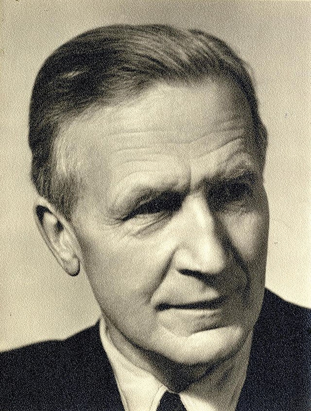
Creator of Futura (1927), the typeface that made Bauhaus geometry commercially viable. Renner applied modernist principles — circles, triangles, absolute geometry — to a typeface family used everywhere from Volkswagen to the Apollo mission plaques on the Moon. The most geometric sans ever drawn.
Wikipedia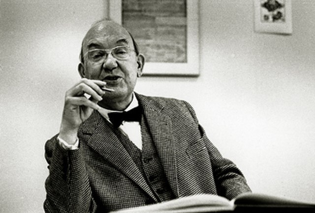
The Swiss typographer who wrote the rulebook — twice. Die neue Typographie (1928) codified modernist asymmetric layout; later he recanted and became a champion of classical tradition. His redesign of Penguin Books in the late 1940s remains a masterclass in systematic typographic thinking at scale.
Wikipedia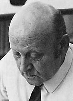
The Swiss designer who gave the world Helvetica. Working with Eduard Hoffmann at the Haas Type Foundry in 1957, Miedinger created Neue Haas Grotesk — a typeface of such precise neutrality it became the default voice of corporate modernity. Renamed Helvetica, it is now the most recognised typeface on earth.
Wikipedia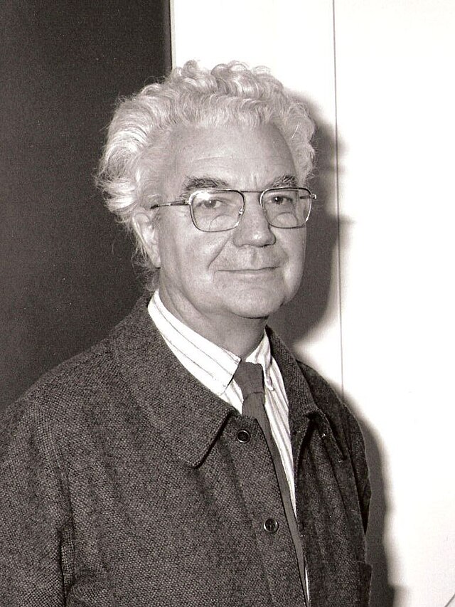
The Swiss master who conceived type as system. Univers (1957) introduced a rational numbering grid for 21 coordinated weights and widths — the first family designed as a coherent whole. His airport signage work and the humanist Frutiger typeface made him the defining voice of wayfinding typography worldwide.
Wikipedia
The Italian modernist who famously said the world would be a better place with only five typefaces in it. His New York City subway signage system — pure Helvetica, pure grid — introduced the International Style to millions of daily commuters. A zealot for clarity, he proved that restraint is a design philosophy, not a limitation.
Wikipedia
The designer who made the Macintosh speak. Kare created the original bitmap fonts — Chicago, Geneva, Monaco, Cairo — that gave computers a human voice for the first time. Working on a 32×32 pixel grid, she crafted letterforms that were both legible and warm. The Mac's friendly face was her face.
Wikipedia
Author of The Elements of Typographic Style (1992) — the book that every serious typographer considers the bible of the discipline. Bringhurst synthesised 500 years of typographic practice into a single authoritative work, arguing that the best typography is invisible: it serves the text, never itself.
WikipediaFrom Gutenberg's press in 1455 to variable fonts and AI-generated letterforms — nearly six centuries of the technology that made written language visible, portable, and designed.